"But what would I wear?" Let me help you find what would be best!
Believe it or not, your outfit choice influences the outcome of the finalized images in your gallery significantly.
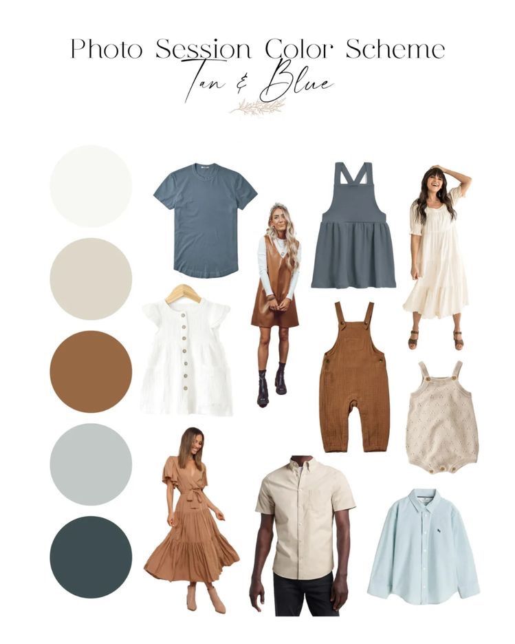
Here is a general guide to keep in mind when picking out your photoshoot wardrobe.
Patterns - Yes, or No?
Patterns can be beneficial to livening up the overall look of your session, but there are some exceptions.
Polka dots - Should be avoided.
Florals - Dainty florals are great choices for women and small children, but bright, large floral prints can be distracting.
Stripes - Thin, closely placed, lighter-in-color stripes are a fan favorite, but thick, highly contrasted stripe patterns can be too much.
Style
Textures are so slept on, and they really shouldn't be! I'm a huge lover of texture in photos. Lace, ruffles, corduroy, knits, denim...you name it, I love it!
Textures are a fun way to incorporate personality and expression into your photo session.
Tones
Neutrals are encouraged, while brighter colors should be strayed away from.
Earthy tones or soft paints of blues, pinks, oranges, muted yellows and even purples can work just as well as your go-to neutral. Mixing and matching these colors with your significant other or your family helps creates the best color wheel combination story for your memories.
Logos
Please, please, please, avoid wearing clothing or any accessories (such as hats, for example) with logos or writing, no matter the size.